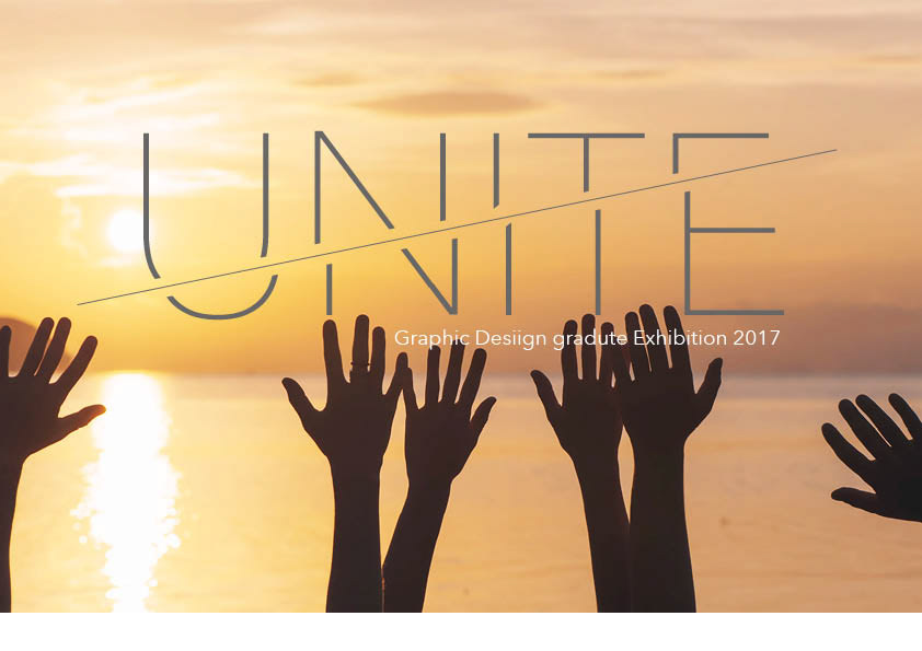
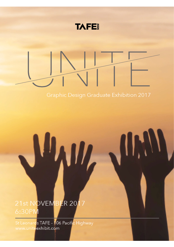
I was required to create branding and a logo for the end of year exhibition. My exhibition name is ‘UNITE’ I choose this name in the way that people who are coming to the end of year exhibition are being ‘united’ for one purpose and that is to view the works at the exhibition. I wanted a soft colour palette with a hint of sophistication. I chose the gray after researching I discovered the colour meaning was that of style and sophistication. The raised hands symbolises that of celebration.